
BloomBoard Case Study
Redesigning the navigation and user experience for a Learning Management System geared towards Educators
Roles: User Research | UX Design | User Interface Design | Visual Design
Goal
BloomBoard, a Learning Management System focused on facilitating the continual professional development needs of Teachers and District Leads. had been on the market for a couple years and like most products was built at speed in order to meet the immediate needs of stakeholders and users alike which resulted in expected unwanted friction points and trouble spots (affectionately known as UX debt). After I joined, it seemed like a great opportunity to step back and look at the whole product to see how we could optimize and offer a more cohesive experience for the user.

APPROACH
1. Understanding the problem better
I first met with the necessary internal stakeholders (such as Product Managers , Customer Success Team and our Educational Leadership Team) as well as a sample group of 7 present users to better understand and document issues and opportunities. To meet with present users, I built up a database of users, set up the interviews, wrote the script, and conducted these via recorded 1-on-1, 45-minute interview sessions.
I then analyzed these findings and shared the results with the design team as well as the company as a whole. I also created other forms of documentation like journey maps and user cycle flows to better understand the full breadth of the problem. Problems noticed:
1. A confusing experience
"I don't really know how this works or that works or what we are supposed to do here" - user quote
The users were finding this 2 year old tool difficult to navigate and understand (grok).
2. Lack of understanding of Value Proposition
"until people feel like this is supporting their learning, they're not going to use it." - Facilitator quote
"You just get busy and it's at the bottom of your list if it's not a requirement." - user quote
Many of our users were not clear on what value the tool had to them
3. Product not reflective of our user's behaviors
"The notifications on the programs/room page is vague and when I click in, it doesn't take me to the notified item. Plus it might not be
something i even care about. To have a little bit more information (should I take the time to go in right now) would be useful." - user quote
The tool as designed did not align well with our user's behaviors and goals
We used the learnings from this study to inform and direct our design strategy (in conjunction with other considerations like first-time user experience, etc.).
BloomBoard's original design
Creating a user journey map helped us understand how a user navigated through the product
Mapping out the full Customer Experience of a Program
Better understanding the different scenarios of users entering in to our product
Documenting how users engage in rooms within our product
Using user research to create a OnBoarding Flow which helps us understand the friction points and possible solutions
2. Design Solutions
The design team then brainstormed and presented, together as well as individually, possible solutions (the designs displayed below are one of a few of my personal design contributions). After an HTML prototype was created, I then conducted consecutive usability tests with users and non-users alike (educators and Professional Development experts) to validate and fine-tune the design. Once we felt we were close enough, the design was passed on to production for development.
A simpler, cleaner architecture of the product
Home Room redesign
Program Overview redesign
Program Section redesign
Room redesign
Explore Page redesign
3. Test and Iterate. Repeat as necessary.
After an HTML prototype was created, I then conducted consecutive usability tests (think-aloud protocol and task-based) with users and non-users alike (educators and Professional Development experts) to validate and fine-tune the design. Once we felt we were close enough, the design was passed on to production for development. Tests were focused on navigation understanding/efficiency and first-time user experience.
"I like where I can go somewhere and get to it without doing a lot of clicking" - user quote
"I like how it's easy and simple and there isn't a lot of other stuff (on the page) to distract you" - user quote
(when viewing the programs on the summary page): "I didn't like that I couldn't see if there was any activity in my programs from here. I can in the present version" - user quote
"i like that it lets me know my in-progress stuff" - user quote
"It looks cleaner, more organized" - user quote
User Research Observations
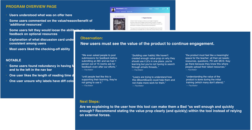
Usability testing results presented to the team. Includes discoveries as well as action items.