
MeWe Case Study
Updating the web and iOS version of this Social Media platform
Roles: UX Design | User Interface Design | Visual Design
Intro to MeWe
MeWe is a Social Media platform based around Private Groups with an emphasis on user privacy.
CHALLENGES
Through user research practices (user interviews, contextual analysis, heuristic evaluation), uncovered the following issues:
1. Difficult to use and understand
The iOS version of the app has a confusing and cluttered UI that is leading to numerous user complaints and lack of adoption.
2. Dated visual styling
A disjointed color palette and iconography that was inconsistent and uncomplimentary to the content.
3. Unintuitive and complicated navigation
A navigation system built with little knowledge or consideration for a user's tasks or goals.
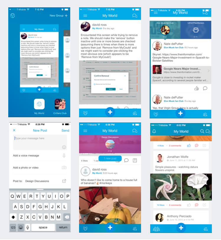
Original design experience
SOLUTIONS
1. Easier-to-understand Interface
Developed personas and clear goals/objectives as well as user journeys /key task analysis. This led to a clearer focus on objectives. The end result was users were getting the quickest, simplest and most intuitive way to meet their needs.
MeWe Navigation Explained
MeWe Site Map
A simpler navigation
2. A more modern styling
While keeping an eye on harmony with the desktop version, created a clean complimentary color palette, visually-consistent iconography and an airy grid design which allowed the content to take center stage, with the goal of a more pleasurable experience and a more positive impression of the product.

A simple but effective color palette
Icons!
3. Simple Navigation
Everything the user is looking for is up-front and center. Nothing is hidden behind hamburger menus or vertical ellipses. A simpler and more intuitive navigation was not only easier for the user to learn and use but also had the distinct advantage of giving the platform a solid ground to build future features off of.
Simplification of the architecture
The same philosophy was used for the redesigning of the web/desktop experience.
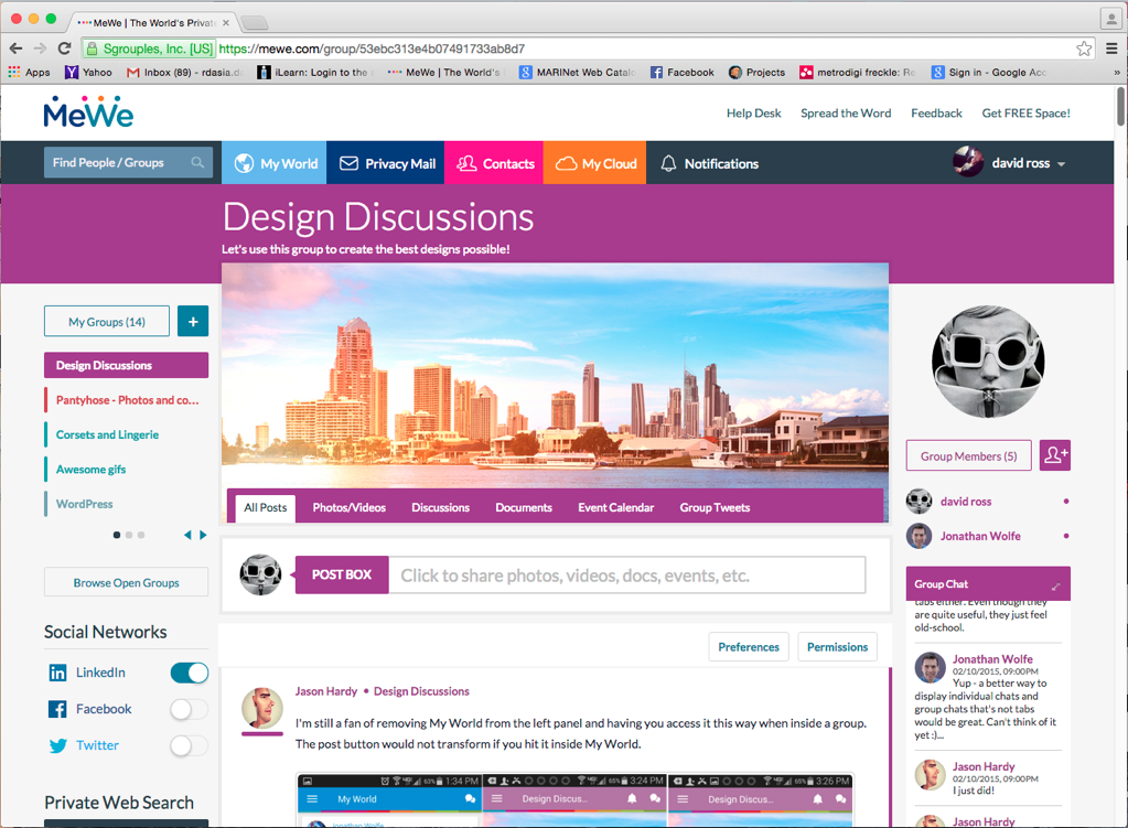
Original Design
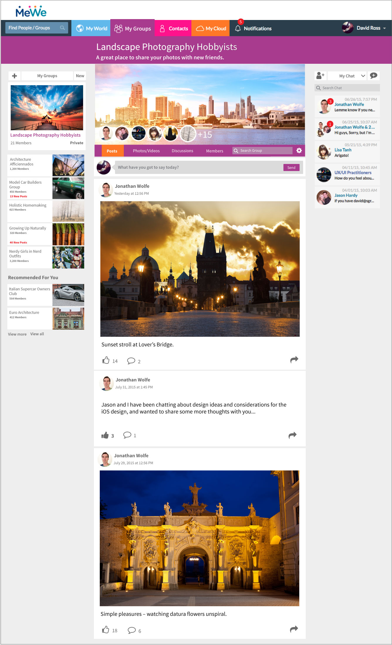
A redesign that emphasis simplicity and clarity.
Designed to let user's imagery to stand out and command the page.
Early design for emojis (before Facebook introduced their version)